Question 1.
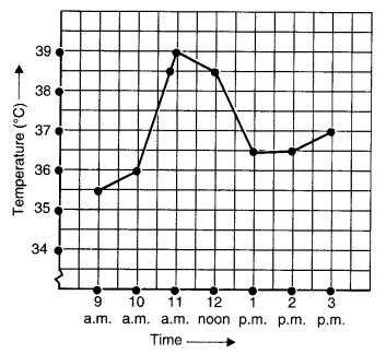
The following graph shows the temperature of a patient in a hospital, recorded every hour.
- (a) What was the patient’s temperature at 1 p.m.?
- (b) When was the patient’s temperature 38.5°C?
- (c) The patient’s temperature was the same two times during the period given. What were these two times?
- (d) What was the temperature at 1.30 p.m.? How did you arrive at your answer?
- (e) During which periods did the patient’s temperature showed an upward trend?
Solution.
- (a) The patient’s temperature at 1 p.m. was 36.5°C.
- (b) The patient’s temperature was 38.5°C at 10.50 a.m. and 12 noon.
- (c) The two times when the patient’s temperature was the same were 1 p.m. and 2 p.m.
- (d) The temperature at 1.30 p.m. was 36.5°C. From the graph, we see that the temperature was constant from 1 p.m. to 2 p.m. Since 1.30 p.m. comes in between 1 p.m. and 2 p.m., therefore we arrived at our answer.
- (e) The patient’s temperature showed an upward trend during the periods 9 a.m. to 10 a.m., 10 a.m. to 11 a.m. and 2 p.m. to 3 p.m.
Question 2.
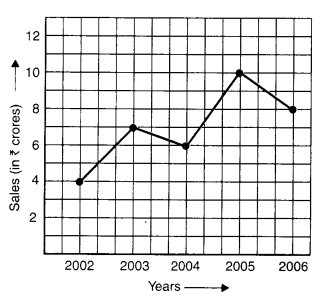
The following line graph shows the yearly sales figures for a manufacturing company.
- (a) What were the sales in
- (i) 2002
- (ii) 2006?
- (b) What were the sales in
- (i) 2003
- (ii) 2005?
- (c) Compute the difference between sales in 2002 and 2006.
- (d) In which year was there the greatest difference between the sales as compared to its previous year?
Solution.
(a) The sales in
(i) 2002 were ₹ 4 crores and in
(ii) 2006 were ₹ 8 crores.
(b) The sales in
(i) 2003 were ₹ 7 crores and in
(ii) 2005 were ₹ 10 crores.
(c) The difference between the sales in 2002 and 2006
= ₹ 8 crores – ₹ 4 crores = ₹ 4 crores
(d) The difference between sales in 2002 and 2003
= ₹ 7 crores – ₹ 4 crores = ₹ 3 crores
The difference between sales in 2003 and 2004
= ₹ 7 crores – ₹ 6 crores = ₹ 1 crore
The difference between the sales in 2004 and 2005
= ₹ 10 crores – ₹ 6 crores = ₹ 4 crores
The difference between sales in 2005 and 2006
= ₹ 10 crores – ₹ 8 crores = ₹ 2 crores
Therefore, in year 2005 the difference between the sales as compared to its previous year was the greatest.
Question 3.
For an experiment in Botany, two different plants, plant A and plant B were grown under similar laboratory conditions. Their heights were measured at the end of each week for 3 weeks. The results are shown by the following graph.
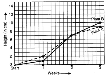
- (a) How high was Plant A after
- (i) 2 weeks
- (ii) 3 weeks?
- (b) How high was Plant B after
- (i) 2 weeks
- (ii) 3 weeks?
- (c) How much did Plant A grow during
- (d) How much did Plant B grow from the end of the 2nd week to the end of the 3rd week?
- (e) During which week did Plant A grow most?
- (f) During which week did Plant B grow least?
- (g) Were the two plants of the same height during any week shown here? Specify.
Solution.
(a) The Plant A
after (i) 2 weeks was 7 cm high and
after (ii) 3 weeks was 9 cm high.
(b) The Plant B
after (i) 2 weeks was 7 cm high and
after (ii) 3 weeks was 10 cm high.
(c) The Plant A grew 9 cm – 7 cm = 2 cm during the 3rd week.
(d) From the end of the 2nd week to the end of the 3rd week, Plant B grew
= 10 cm – 7 cm = 3 cm.
(e) The Plant A grew in 1st week
= 2 cm – 0 cm = 2 cm
The Plant A grew in 2nd week
= 7 cm – 2 cm = 5 cm
The Plant A grew in 3rd week
= 9 cm – 7 cm = 2 cm
Therefore, Plant A grew mostly in the second week.
(f) Plant B grew in 1st week
= 1 cm – 0 cm = 1 cm
Plant B grew in 2nd week
= 7 cm – 1 cm = 6 cm
Plant B grew in 3rd week
= 10 cm – 7 cm = 3 cm
Therefore, Plant B grew least in the first week.
(g) At the end of 2nd week, the two plants shown here were of the same height.
Question 4.
The following graph shows the temperature forecast and the actual temperature for each day of a week:
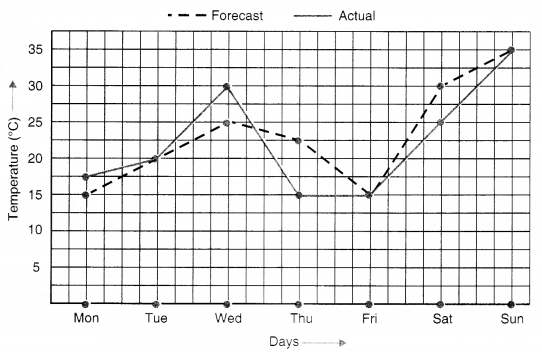
- (a) On which days was the forecast temperature the same as the actual temperature?
- (b) What was the maximum forecast temperature during the week?
- (c) What was the minimum actual temperature during the week?
- (d) On which day did the actual temperature differ the most from the forecast temperature?
Solution.
- (a) The forecast temperature was the same as the actual temperature on Tuesday, Friday and Sunday.
- (b) The maximum forecast temperature during the week was 35°C.
- (c) The minimum actual temperature during the week was 15°C.
- (d)
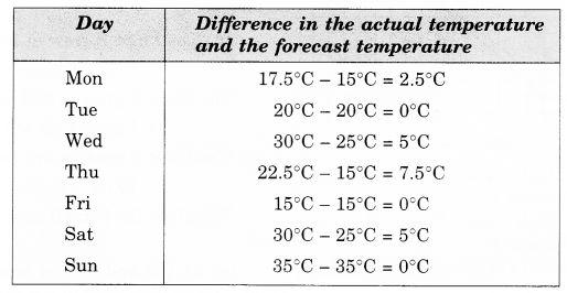
Therefore, the actual temperature differed the most from the forecast temperature on Thursday.
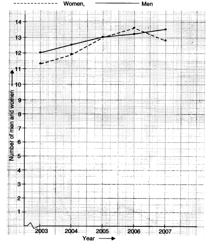
Question 5.
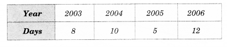
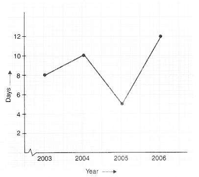
Use the tables below to draw linear graphs.
(a) The number of days a hill side city received snow in different years.
(b) Population (in thousands) of men and women in a village in different years.
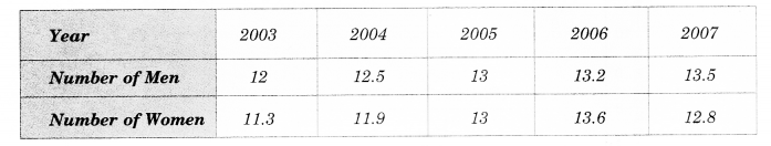
Solution.
Question 6.
Courier-person cycles from a town to a neighboring suburban area to deliver a parcel to a merchant. His distance from the town at different times is shown by the following graph.
- (a) What is the scale taken for the time axis?
- (b) How much time did the person take for the travel?
- (c) How far is the place of the merchant from the town?
- (d) Did the person stop on his way? Explain.
- (e) During which period did he ride fastest?
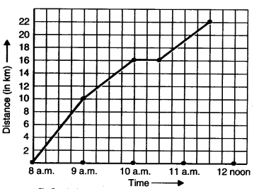
Solution.
- (a) The scale taken for the time axis is 4 units = 1 hour.
- (b) The time taken by the person for the travel 8 a.m. to 11.30 a.m. = 3 1/2 hours.
- (c) The place of the merchant from the town in 22 km.
- (d) Yes. This is indicated by the hori¬zontal part of the graph (10 a.m. – 10.30 a.m.)
- (e) He rides fastest between 8 a.m. and 9 a.m. (As line is more steep in this period).
Question 7.
Can there be a time-temperature graph as follows ? Justify your answer.
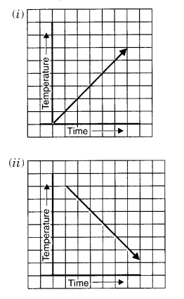
Solution.
(i) Yes; it can be
It shows a time-temperature graph. It shows an increase in temperature with an increase in time.
(ii) Yes; it can be
It shows a time-temperature graph.
It shows a decrease in temperature with increase in time.
(iii) It cannot be a time-temperature graph because it shows infinitely many different temperatures at one particular time which is not possible.
(iv) Yes; it can be
It shows a time-temperature graph,
It shows a fixed temperature at different times.
Question 1.
Plot the following points on a graph sheet. Verify if they lie on a line.
- (a) A(4, 0), B(4, 2), C(4, 6), D(4, 2.5)
- (b) P(l, 1), Q(2, 2), R(3, 3), S(4, 4)
- (c) K(2, 3), L(5, 3), M(5, 5), N(2, 5)
Solution.
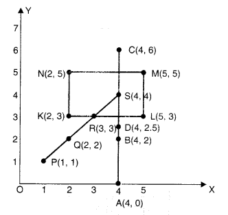
- (a) The points lie on a line.
- (b) The points lie on a line.
- (c) The points do not lie on a line.
Question 2.
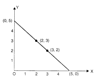
Draw the line passing through (2, 3) and (3, 2). Find the coordinates of the points at which this line meets the x-axis and y-axis.
Solution.
The coordinates of the points at which this line meets the x-axis and y-axis are (5, 0) and (0, 5) respectively. See the graph given above.
Question 3.
Write the coordinates of the vertices of each of these adjoining figures.
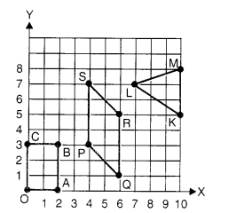
Solution.
O → (0, 0)
A → (2,0)
B → (2, 3)
C → (0,3)
P → (4, 3)
Q → (6, 1)
R → (6, 5)
S → (4, 7)
K → (10, 5)
L → (7, 7)
M → (10, 8)
Question 4.
State whether True or False. Correct that is false.
- (i) A point whose x-coordinate is zero and y-coordinate is non-zero will lie on the y-axis.
- (ii) A point whose y-coordinate is zero ‘ and x-coordinate is 5 will lie on y-axis.
- (iii) The coordinates of the origin are (0, 0).
Solution.
- (i) True
- (ii) False; A point whose y-coordinate is zero and x-coordinate is 5 will lie on x-axis.
- (iii) True
Question 1.
Draw the graphs for the following tables of values, with suitable scales on the axes.
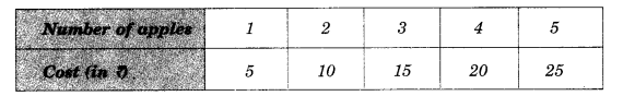
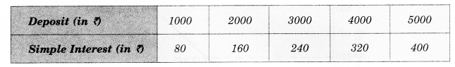
(a) Cost of apples
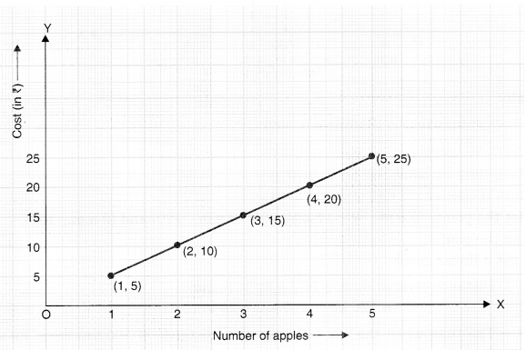
(b) Distance travelled by a car
- (i) How much distance the car cover during the period 7.30 a.m. to 8 a.m.?
- (ii) What was the time when the car had covered a distance of 100 km since it starts?
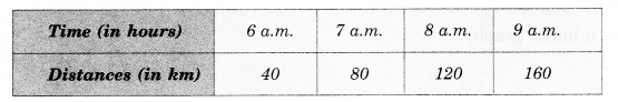
(c) Interest on deposits for a year.
- (i) Does the graph pass through the origin?
- (ii) Use the graph to find the interest on? 2500 for a year.
- (iii) To get an interest of ? 280 per year, how much money should be deposited?
Solution.
Scale:
On horizontal axis: 2 units = 1 apple
On vertical axis: 1 unit = ₹ 5
• Mark number of apples on the horizontal axis.
• Mark cost (in ?) on the vertical axis.
• Plot the points: (1, 5), (2, 10), (3, 15), (4, 20) and (5, 25)
• Join the points.
We get a linear graph
Scale:
On horizontal axis: 2 units = 1 hour
On vertical axis: 2 units = 40 km
• Mark time (in hours) on the horizontal axis.
• Mark distances (in km) on the vertical axis.
• Plot the points (6 a.m., 40), (7 a.m., 80) (8 a.m., 120) and (9 a.m., 160).
• Join the points.
We get a linear graph.
(i) Distance covered during 7.30 a.m. to 8 a.m.
= 120 km – 100 km = 20 km
(ii) The time when the car had covered a distance of 100 km since its start was 7.30 a.m.
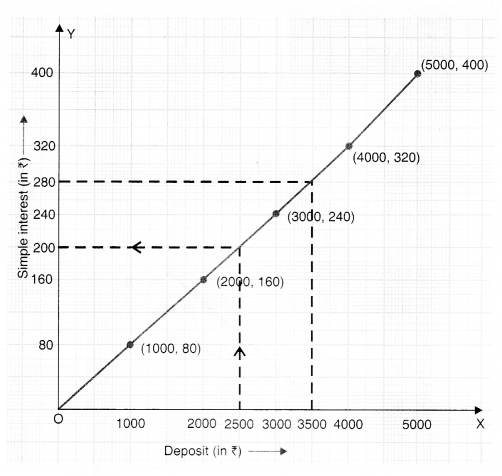
On horizontal axis: 2 units = ₹ 1000
On vertical axis: 2 units = ₹ 80
• Mark deposit (in ? on the horizontal axis.
• Mark simple interest (in ?) on the vertical axis.
• Plot the points (1000, 80), (2000, 160), (3000, 240) (4000, 320) and (5000, 400).
• Join the points.
We get a linear graph.
- (i) Yes! The graph passes through the origin.
- (ii) Interest on ₹ 2500 for a year = ₹ 200
- (iii) To get an interest of ₹ 280 per year, ₹ 3500 should be deposited.
Question 2.
Draw a graph for the following:
Is it a linear graph?
Is it a linear graph?
Solution
Scale:
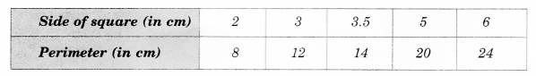
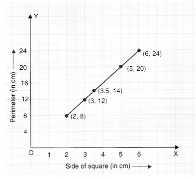
On horizontal axis: 1 unit = 1 cm
On vertical axis: 1 unit = 4 cm
• Mark side of the square (in cm) on the horizontal axis.
• Mark perimeter (in cm) on the vertical axis.
• Plot the points (2, 8), (3, 12), (3.5. 14) (5, 20) and (6, 24).
• Join the points.
Yes ; it is a linear graph.
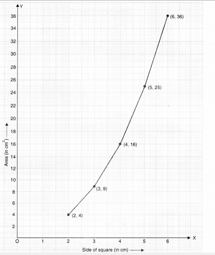
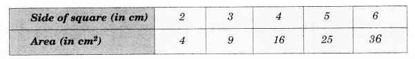
• Scale:
On horizontal axis: 2 units = 2 cm
On vertical axis: 1 unit = 2 cm
• Mark side of the square (in cm) on the horizontal axis.
• Mark area (in cm ) on the vertical axis.
• Plot the points (2, 4) (3, 9), (4, 16), (5, 25) and (6, 36).
• Join the points.
The graph we get is not linear.