Question 1.
Give five examples of data that you collect from your day-to-day life.
Solution:
Five examples of data that we can gather from our day-to-day life are
- (i) number of students in our class.
- (ii) number of fans in our class.
- (iii) electricity bills of our house for last two years.
- (iv) election results obtained from television or news paper.
- (v) literacy rate figures obtained from educational survey. Of course, remember that there can be many more different answers.
Question 2.
Classify the data in Q.1 above as primary or secondary data.
Solution:
We know that, when the information was collected by the investigator herself or himself with a definite objective in her or his mind, the data obtained is called primary data.
∴ In the given data (in Q.1) examples (i), (ii) and (iii) are called primary data and when the information was gathered from a source which already had the information stored, the data obtained is called secondary data.
∴ In the given data (in Q.1) examples (iv) and (v) are called secondary data.
Question 1.
The blood groups of 30 students of class VIII are recorded as follows
A, B, 0, 0, AB, 0, A, 0, B, A, 0, B, A, 0, 0,
A, AB, 0, A, A, 0, 0, AB, B, A, 0, B, A, B, 0
Represent this data in the form of a frequency distribution table. Which is the most common and which is the rarest blood group among these students?
Solution:
The number of students who have a certain type of blood group is called the frequency of those blood groups. To make data more easily undrestandable, we write it in a table, as given below

From table, we observe that the higher frequency blood group i.e., most common blood group is O and the lowest frequency blood group i.e., rarest blood group is AB.
Question 2.
The distance (in km) of 40 engineers from their residence to their place of work were found as follows
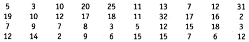
Construct a grouped frequency distribution table with class size 5 for the data given above taking the first interval as 0-5 (5 not included). What main features do you observe from this tabular representation?
Solution:
To present such a large amount of data, so that a reader can make sense of it easily, we condense it into groups like 0-5, 5-10,.... 30-35 (since, our data is from 5 to 32). These grouping are called classes or class-intervals and their size is called the class size or class width which is 5 in this case. In each of these classes, the least number is called the iower class limit and the greatest number is called the upper class limit, e.g., in 0-5, 0 is the lower class limit and 5 is the upper class limit.
Now, using tally marks, the data (given) can be condensed in tabular form as follows
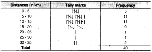
Presenting data in this form simplifies and condenses data and enables us to observe certain important feature at a glance. This is called a grouped frequency distribution table. We observe that the classes in the table above are non-overlapping.
Question 3.
The relative humidity (in %) of a certain city for a month of 30 days was as follows
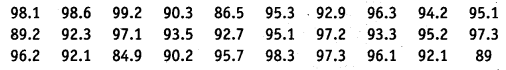
- (i) Construct a grouped frequency distribution table with classes 84-86, 86-88 etc.
- (ii) Which month or season do you think this data is about?
- (iii) What is the range of this data?
Solution:
(i) We condense the given data into groups like 84 – 86, 86 – 88, 98-100. (since, our data is from 86.5 to 99.2) the class width in this case is 2. Now, the given data can be condensed in tabular form as follows
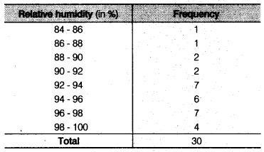
(ii) From table, we observe that the data appears to be taken in the rainy season as the relative humidity is high.
(iii) We know that, Range = Upper limit of data - Lower limit of data
∴ Range = 99.2 - 84.9 =14.3
Question 4.
The heights of 50 students, measured to the nearest centimeters have been found to be as follows
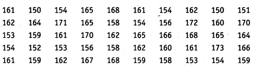
- (i) Represent the data given above by a grouped frequency distribution table, taking class intervals as 160-165, 165-170 etc.
- (ii) What can you conclude about their heights form the table?
Solution:
(i) We condense the given data into groups like 150-155, 155-160, ...,170-175. (since, our data is from 150 to 172) The class width in this case is 5.
Now, the given data can be condensed in tabular form as follows
(ii) From the table, our conclusion is that more than 50% of students (i.e.,12 + 9+ 14 = 35) are shorter than 165 cm.
Question 5.
A study was conducted to find out the concentration of sulphur dioxide in the air in parts per million (ppm) of a certain city. The data obtained for 30 days is as follows
- (i) Make a grouped frequency distribution table for this data with class intervals as 0.00-0.04, 0.04-0.08 and so on.
- (ii) For how many day’s was the the concentration of sulphur dioxide more than 0.11 parts per million (ppm)?
Solution:
(i) We condense the given data into groups like 0.00-0.04, 0. 04-0.08,...., 0.20-0.24. (since, our data is from 0.01 to 0.22). The class width in this case is 0.04.
Now, the given data can be condensed in tabular form as follows
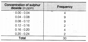
(ii) The concentration of sulphur dioxide was more than 0.11 ppm for 2 + 4 + 2 = 8 days (by table).
Question 6.
Three coins were tossed 30 times simultaneously. Each time the number of heads occurring was noted down as follows
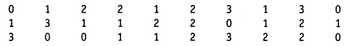
Prepare a frequency distribution table for the data given above.
Solution:
Firstly, we write the data in a table
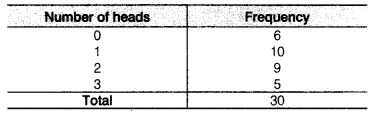
In above table, we observe that the repeatition of "0" in given data is 6 times, 1 as to 10 times, 2 as 9 times and 3 as 5 times. Also, the above table is called an ungrouped frequency distribution table or simply a frequency distribution table.
Question 7.
The value of π upto 50 decimal places is given below
3.14159265358979323846264338327950288419716939937510
- (i) Make a frequency distribution of the digits from 0 to 9 after the decimal point.
- (ii) What are the most and the least frequently occurring digits?
Solution:
Firstly, we write the data i.e., digits from 0 to 9 after the decimal point in a table below
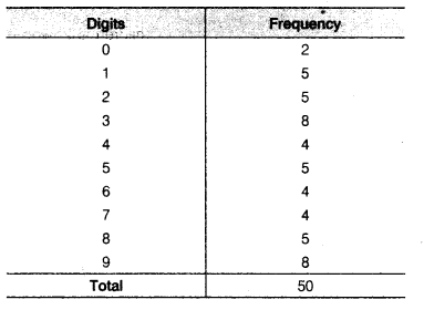
- (i) From the table, we observe that the digit’s after the decimal points i.e., 0,1, 2, 3, 4, 5, 6, 7, 8, 9 repeated 2, 5, 5, 8, 4, 5, 4, 4, 5, 8 times, respectively.
- (ii) From the table, we observe that the digits after the decimal point 3 and 9 are most frequently occurring i.e 8 times. The digit 0 is the least occurring i.e., only 2 times.
Question 8.
Thirty children were asked about the number of hours they watched TV programmes in the previous week.
The results were found as follows
- (i) Make a grouped frequency distribution table for this data, taking class width 5 and one of the class intervals as 5-10.
- (ii) How many children watched television for 15 or more hours a week?
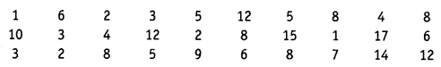
Solution:
(i) We condense the given data into groups like 0-5, 5-10 15-20.
(since, our data is from 1 to 17). The class width in this case is 5.
Now, the given data can be condensed in tabular form as follow
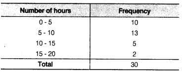
(ii) From table, we observe that the number of children is 2, who watched television for 15 or more hours a week.
Question 9.
A company manufactures car batteries of a particular type. The lives (in years) of 40 such batteries were recorded as follows
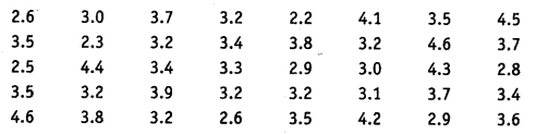
Construct a grouped frequency distribution table for this data, using class intervals of size 0.5 starting from the interval 2-2.5.
Solution:
We condense the given data into groups like 2.0-2.5, 2.5-3.0 ,4.5- 5.0. (since, our data is from 2.2 to 4.6). The class width in this case is 5.
Now, the given data can be condensed in tabular form as follows
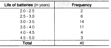
The above table is called a grouped frequency distribution table.
Question 1.
A survey conducted by an organisation for the cause of illness and death among the women between the ages 15-44 (in years) worldwide, found the following figures (in %)
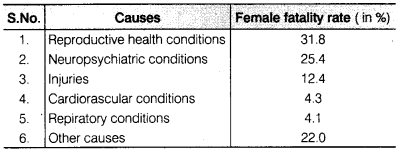
- (i) Represent the information given above graphically.
- (ii) Which condition is the major cause of womens ill health and death worldwide?
- (iii) Try to find out, with the help of your teacher, any two factors which play a major role in the cause in (ii) above being the major cause.
Solution:
(i) We draw the bar graph of this data in the following steps. Note that, the unit in the second column is percentage.
- We represent the causes (variable) on the horizontal axis choosing any scale, since width of the bar is not important but for clarity, we take equal widths for all bars and maintain equal gaps in between. Let on cause be represented by one unit.
- We represent the female fatality rate (value) on the vertical axis. Here, we can choose the scale as 1 unit = 4%.
- To represent our first cause i.e, reproductive health conditions, we draw & rectangle bar with width 1 unit and height 31.8 units.
- Similarly, other heads are represented leaving a gap of 1 unit in between two consecutive bars.
Now the graph is drawn in figure.
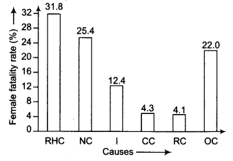
(ii) From graph, we observe that "reproductive health conditions" is the major cause of women"s ill health and death world wide because it has maximum percentage among the causes i.e.,31.8%.
Question 2.
The following data on the number of girls (to the nearest ten) per thousand boys in different sections of Indian society is given below
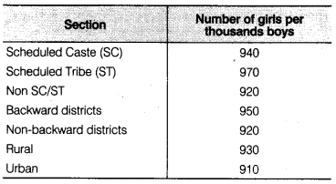
- (i) Represent the information above by a bar graph.
- (ii) In the classroom discuss, what conclusions can be arrived at from the graph.
Solution:
(i) We draw the bar graph of this data, note that the unit in the second column is number of girls per thousand boys.
We represent the section on the horizontal axis choosing any scale, since width of the bar is not important but for clarity, we take equd widths for all bars and maintain equal gaps in between. Let on section be represented by one unit.
We represent the number of girls per thousand boys on the vertical axis.
Now, the graph is drawn in figure.
We represent the number of girls per thousand boys on the vertical axis. Here, we can choose the scale as 1 unit = 100.
Now, the graph is drawn in figure
(ii) From graph, we observe that scheduled tribe (ST) number of girls is major section in different sections of Indian society, because it has maximum number of girls per thousand boys i.e., 970.
Question 3.
Given below are the seats won by different political parties in the polling outcome of a state assembly elections
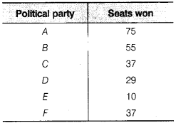
- (i) Draw a bar graph to represent the polling results.
- (ii) Which political party won the maximum number of seats?
Solution:
We draw the bar graph of this data, note that the unit in the second column is seats won by political party.
(i) We represent the political party on the horizontal axis choosing any scale, since width of the bar is not important but for clarity, we take equal widths for all bars and maintain equal gaps in between. Let on political party be represented by one unit.
(ii) We represent the seats won on the vertical axis. Here, we can choose the scale as 1 unit = 10
Now, the graph is drawn in figure
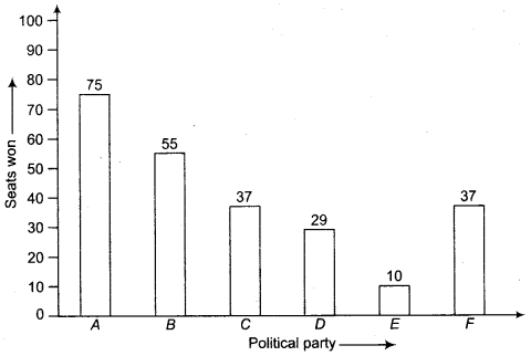
Party "A" Won the maximum number of seats. i.e, 75.
Question 4.
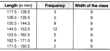
The length of 40 leaves of a plant measured correct to one millimetre and the obtained data is represented in the following table
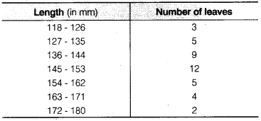
- (i) Draw a histogram to represent the given data.
- (ii) Is there any other suitable graphical representation for the same data?
- (iii) Is it correct to conclude that the maximum number of leaves 153 mm long and Why?
Solution:
(i) We know that, the areas of the rectangles are proportional to the frequencies in a histogram. Now, we get the following modified table by given data
Now, we draw the histogram for given data
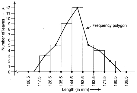
(ii) Frequency polygon.
(iii) No, because the maximum number of leaves have their lengths lying in
the interval 145-153.
Question 5.
The following table gives the lifetimes of 400 neon lamps
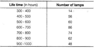
- (i) Represent the given information with the help of a histogram.
- (ii) How many lamps have a lifetime of more 700 h?
Solution:
(i) Here, we will make a modified table by given data.

Now, we draw the histogram for above table
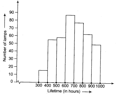
(ii) 184 lamps have a life time of more than 700 h i.e.,74 + 62 + 48 = 184.
Question 6.
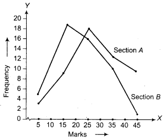
The following table gives the distribution of students of two sections according to the marks obtained by them
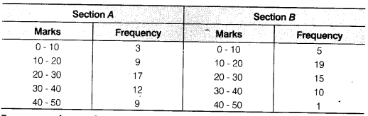
Represent the marks of the students of both the sections on the same graph by two frequency polygons. From the two polygons compare the performance of the two sections.
Solution:
Here, we make modified tables by given data.
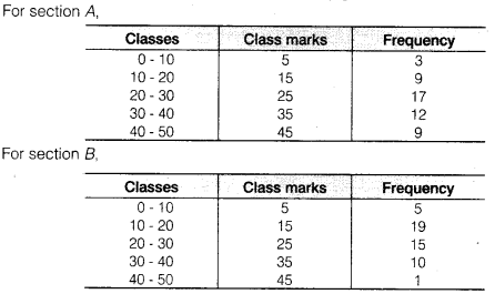
Now, required frequency polygon curves are
Question 7.
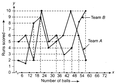
The runs scored by two teams A and B on the first 60 balls in a cricket match are given below
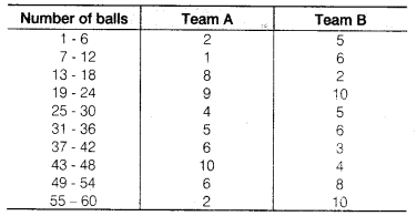
Represent the data of both the teams on the same graph by frequency polygons.
Solution:
First make the class intervals continuous.
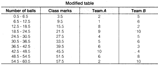
Now, draw a frequency polygon curve
Question 8.
A random survey of the number of children of various age groups playing in a park was found as follows
Draw a histogram to represent the data above.
Solution:
We know that, the areas of the rectangles are proportional to the frequencies in a histogram. Here, the widths of the rectangles are varying. So, we need to make certain modifications in the lengths of the rectangles, so that the areas are again proportional to the frequencies.
- Select a class interval with the minimum class size. The minimum class size is 1.
- The lengths of the rectangles are then modified to be proportionate to the class size
Now, we get the following table
So, the correct histogram with varying width is given below.
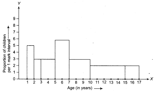
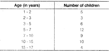
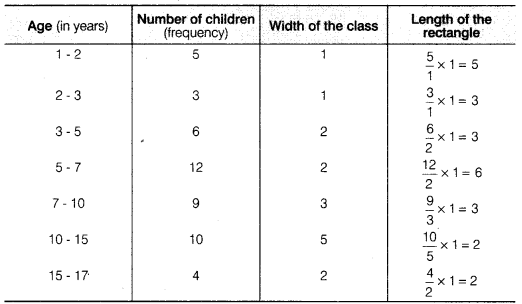
Question 9.
100 surnames were randomly picked up from a local telephone directory and a frequency distribution of the number of letters in the English alphabet in the surnames was found as follows
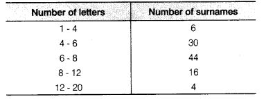
- (i) Draw a histogram to depict the given information.
- (ii) Write the class interval in which the maximum number of surnames lie.
Solution:
(i) We know that, the areas of the rectangles are proportional to the frequencies in a histogram. Here, the widths of the rectangles are varying. So, we need to make certain modifications in the lengths of the rectangles. So that the areas are again proportional to the frequencies.
- Select a class interval with the minimum class size. The minimum class size is 2.
- The lengths of the rectangles are then modified to be proportionate to the class size 2.
Since we have calculated these lengths for interval of 2 letters in each case, we may call these lengths as proportion of surnames per 2 mark interval.
So, the correct histogram with varying width is given below.
Here, we make a modified table by given data with minimum class size 2.
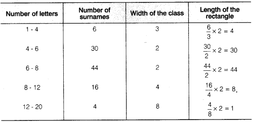
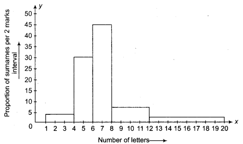
(ii) The class interval in which the maximum number of surnames lie is 6-8.
Question 1.
The following number of goals were scored by a team in a series of 10 matches
2, 3, 4, 5, 0, 1, 3, 3, 4, 3.
Find the mean, median and mode of these scores.
Solution:
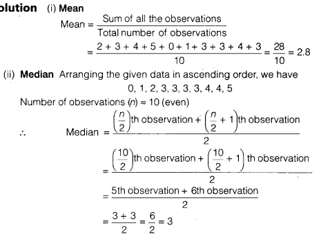
(iii) Mode Arranging the given data in ascending order, we have 0, 1,2, 3, 3, 3, 3, 4, 4, 5.
Here, 3 occurs most frequently (4 times)
∴ Mode = 3
Question 2.
In a mathematics test given to 15 students, the following marks (out of 100) are recorded
41, 39, 48, 52, 46, 62, 54, 40, 96, 52, 98, 40, 42, 52, 60
Find the mean, median and mode of this data.
Solution:
(i) Mean
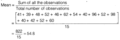
(ii) Median Arranging the given data in descending order, we have 98, 96, 62, 60, 54, 52, 52, 52, 48, 46, 42, 41,40, 40, 39
Number of observations (n) = 15 which is odd.

(iii) Mode Arranging the data in descending order, we have 98, 96, 62, 60, 54, 52, 52, 52, 48, 46, 42, 41,40, 40, 39.
Here, 52 occurs most frequently (3 times).
∴ Mode = 52
Question 3.
The following observations have been arranged in ascending order. If the median of the data is 63, find the value of x.
29, 32, 48, 50, x, x + 2, 72, 78, 84, 95
Solution:
Number of observations (n) = 10which is even.
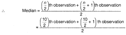
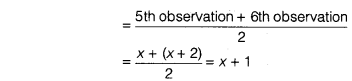
According to question, median = 63
∴ x + 1 = 63 ⇒ x = 63 – 1 = 62
Hence, the value of x is 62.
Question 4.
Find the mode of 14, 25,14, 28,18,17,18,14, 23, 22,14 and 18.
Solution:
The given data is,
14, 25, 14, 28, 18, 17, 18, 14, 23, 22, 14, 18
Arranging the data in ascending order, we have
14, 14, 14, 14, 17, 18, 18, 18, 22, 23, 25, 28
Here, 14 occurs most frequently (4 times).
∴ Mode = 14
Question 5.
Find the mean salary of 60 workers of a factory from the following table
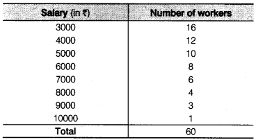
Solution:
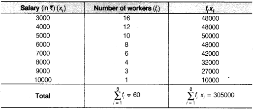
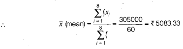
Hence, the mean salary is ₹ 5083.33.
Question 6.
Give one example of a situation in which
- (i) the mean is an appropriate measure of central tendency.
- (ii) the mean is not an appropriate measure of central tendency but the median is an appropriate measure of central tendency.
Solution:
- (i) Mean marks in a test in mathematics,
- (ii) Average beauty